

The color of the year for 2016
First of all Happy 2016, very late I was away for a long time, I know, but it was for a good cause, I was having ideas, studying, researching, to bring news soon I will have and will be more present here but on Instagram I always try to update and bring Tips, if you still don't follow me, just add me @saladacasa But let's get to the point, inspirations:
And to start well, let's see the colors, according to pantone (a company known for its color systems) widely used in the graphics industry and which also influences, in several sectors, including Decoration, I know that there are paint industries that have indicated another tone but I will base myself on the trend color chosen by Pantone this year . And enough suspense, this year's chosen color is not just one, there are two more: Rose Quartz and Serenity.

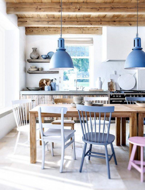
That is, a Rosé and a Blue, 2 tones that make a good composition for those who enjoy pastel tones, it has a soft, calm, elegant look that is easy to compose any environment.
Look how many inspirations these tones can generate….
Get inspired:

If you are thinking of changing the sofa or having the upholstery repaired, this might be a good time to use the colors of the year in this project, and even paint the wall to decorate it…. As they are pastel tones, they are very comfortable on the eyes.
At the head...

Revamping furniture and appliances with the colors of the year is also worth

You can be creative with the colors,

When choosing a coating color

In accessories, furniture, etc….
You can choose to use the trend colors of the year together or separately, either way they have a very neutral tone that goes well with many other colors, if you have doubts which color chart matches these tones when composing your environment, or style, go to the pantone, they made several color charts that harmonize these tones, you don't run the risk of making a mistake.
Images pinterest


